First, let’s understand what is a landing page. In Russian language this term is usually translated as “landing page” or “landing page”. Use just tracing “landing page“. The last option occurs often because webmasters usually know what is this phenomenon, and therefore further explanation is not required. Hereinafter for brevity we will also use the word “landing”, referring to the landing page.

Landing page
What even is this landing? In fact, this special web page, whose main task is to encourage the visitor to certain actions: to subscribe, to buy a particular product, install the program or do something else. The landing page has its own structure, to deviate from which is not desirable, and in some cases very risky. Only by following all the rules of creating the right landing page you can achieve the conversion of leads of up to 20%, which is considered an excellent result.
The rules for creating landing page
What are the basic rules of creating a landing page? On the selling page must have a logo. Unless you just Masha Petrova, while away on maternity leave last year over the sale of Avon perfume. In all other cases the logo is mandatory. How to develop it — a topic for another article. So we hope that you will independently study this issue. Well, the logo is there, then what?

The second item is a header. The title should generate interest in the material, to intrigue. Reading the title the visitor is already mentally prepared that he will be presented with a landing page. In the preparation of the title short and important answer to the question: what is this landing page. Here is an example of good and bad landing page-headline: “Read about our soap bubbles of red, which we brought from China to sell in Russia three times more expensive” — a bad title; “the Brightest, funniest and greatest: soap bubbles have in Russia!” — a good headline.
On the landing page does not need to chew and to analyze the proposed product. Remember that landing is not Wikipedia. Nobody will read long boring descriptions with lots of paragraphs and subparagraphs. Information should be concise, to tell only the essence and necessarily beneficial for the seller side. In the structure of the information block should not be used replays, which can only bore the visitor. It is better to design a page so that the potential buyer did not have to look for the “Buy” button or “Download” — may she be always at hand. By the way, the buttons like “Download” or “Buy” are call to action, that is, a call to action. They have to be understandable for the visitor. Here are examples of good and bad buttons.
Good: buy, sell, order, sign up.
The bad: OK, ready, send, here, here.
The button should be easy to find. To do this, it should hang in the mind and draw in bright colors. It is important not to overdo it, the button design must match the design of the landing page and be a part of it.
With regard to semantic content, then be sure to tell why your proposal is unique, what advantages does it have over the competitors ‘ offers and why you need to use them. On the landing you can also give answers to questions that may arise from the user when purchasing the product. This is also important because people are more likely to buy the product, which he at least knows something, than a strange cat in the bag.
It might be nice to add to the landing page of testimonials from those who have already bought the product. Many add to this section the fake reviews and make a mistake. Any falsehood can be felt very clearly, so don’t underestimate the mental capabilities of our future customers. You can still add links to recognizable in society influencers who are already using the product. Place the countdown timer to some event, for example, increasing prices to give the customer the impression of scarcity of the product or its uniqueness in one way or another.
Choose a website Builder
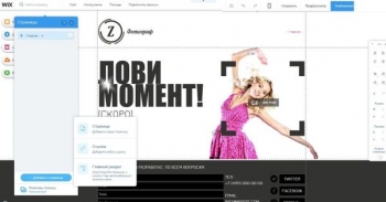
Well, you think of design, dealt with the future blocks of the landing, sent free samples to celebrities with the condition of opinion about what is liked and what is not. It’s time to go do a landing page. As always, one of the most suitable tools for this purpose is recognized as a website Builder Wix. The developers of this designer took care of everything for you. That is why the Wix user will not have to fuss. All he’s got left is to add a landing page of several templates available in the basic version of Wix.

The choice of template for a landing page occurs at the first stage, immediately after registration. The Wix developers have changed the design and now find “landing” has become even easier. Once you have decided on the design of the landing page, you need to add it. To the top of the screen, click “Pages” and then at the bottom of the screen will appear on the blue words “Add a page”. Select “Layouts”, among which are standard and without footer and header. Choose the one that best fits the task at hand and plan design. Next comes the best part — the content of the landing page content.

We do not tire of repeating that Wix has templates for all occasions and it greatly facilitates the creation of websites. This Wix compares favorably with other CMS. Needless to say, that your templates are in the site Builder and landing pages. Wix may be, has its drawbacks, some people think it is not very convenient, besides the designer revealed in full power only in a paid subscription, but the templates are exactly what is rightfully proud of its developers.
Wix can be used in both paid and free versions. For small projects will probably be enough free capacity, but a serious campaign, including using one or more landing pages should be decorated to maximise it’s solid. For this approach one of the paid tariff. The main disadvantage of using the free Wix is the inability to attach your domain, and it will agree, it is important for a serious advertising campaign. However, even in the basic version of Wix is capable of much. Register now and check for yourself. The cost of subscription for one year can hardly leave anyone without pants.